Recently we talked about resizing checkboxes and radios; I thought I’d give a quick update as to what happened next.
Improving things with industry
The first thing we did, was to identify specific problems in browsers we’d discovered during our research. Once we had these written up, we filed (or updated) the following issues:
- Firefox (Windows) – Regression: Checkboxes can no longer be resized using CSS
- Opera (Windows 10) – Radios and checkboxes use Windows Classic styles on Windows 10 (issue ID DNA-43148)
- Chrome (OS X) – Can’t arbitrarily resize radios / checkboxes
- Firefox (OS X) – Consider hand-rolling radios and checkboxes for resizability
- Safari (OS X) – Can’t arbitrarily resize radios / checkboxes
- Safari (iOS) – Radio buttons have a fixed border radius making them look square when resized
We’ve had some indication that there’s interest in fixing this issue from at least a few of the companies. Opera fixed their issue as soon as they were notified, although it hasn’t appeared in a released version of the browser yet.
Improving things ourselves
We also took some action at our end.
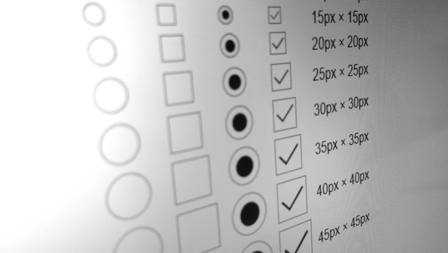
Looking at our browser statistics, updating our styles to make radio buttons and inputs bigger would improve the situation for around 82% of our users. A further 14% or so would see no difference, and (a decreasing) 4% would receive a slightly worse presentation. We decided on the basis of these figures to increase the size of our ‘block label’ checkboxes and radios and to do the same to our ‘option select’ component. These aren’t live yet but will gradually roll out as parts of the system are updated.
Through a combination of our own fixes and updates from browser developers, we’re hopeful that users will have an easier time using both GOV.UK and the wider web in the future.
You can follow Robin on Twitter, sign up now for email updates from this blog or subscribe to the feed.
If this sounds like a good place to work, take a look at Working for GDS - we're usually in search of talented people to come and join the team.

1 comment
Comment by Davide Rizzo posted on
I am not sure the increasing the size of the radio/check symbol itself is what we want. Even on browsers that enable it, it often look bloated and ugly. Increase the hit area, sure! Allow for an easy way to customise the icon, sure! But the ability to wrap the input in the label and increase the hit area to the whole control has been available since the early days.
I think the problem is caused by poor implementation by devs in the past, not linking the label and ingraining users with the notion that the tiny icon was the only clickable part.